AXIS Design System
The pillars I set for the new design system and platform refresh:
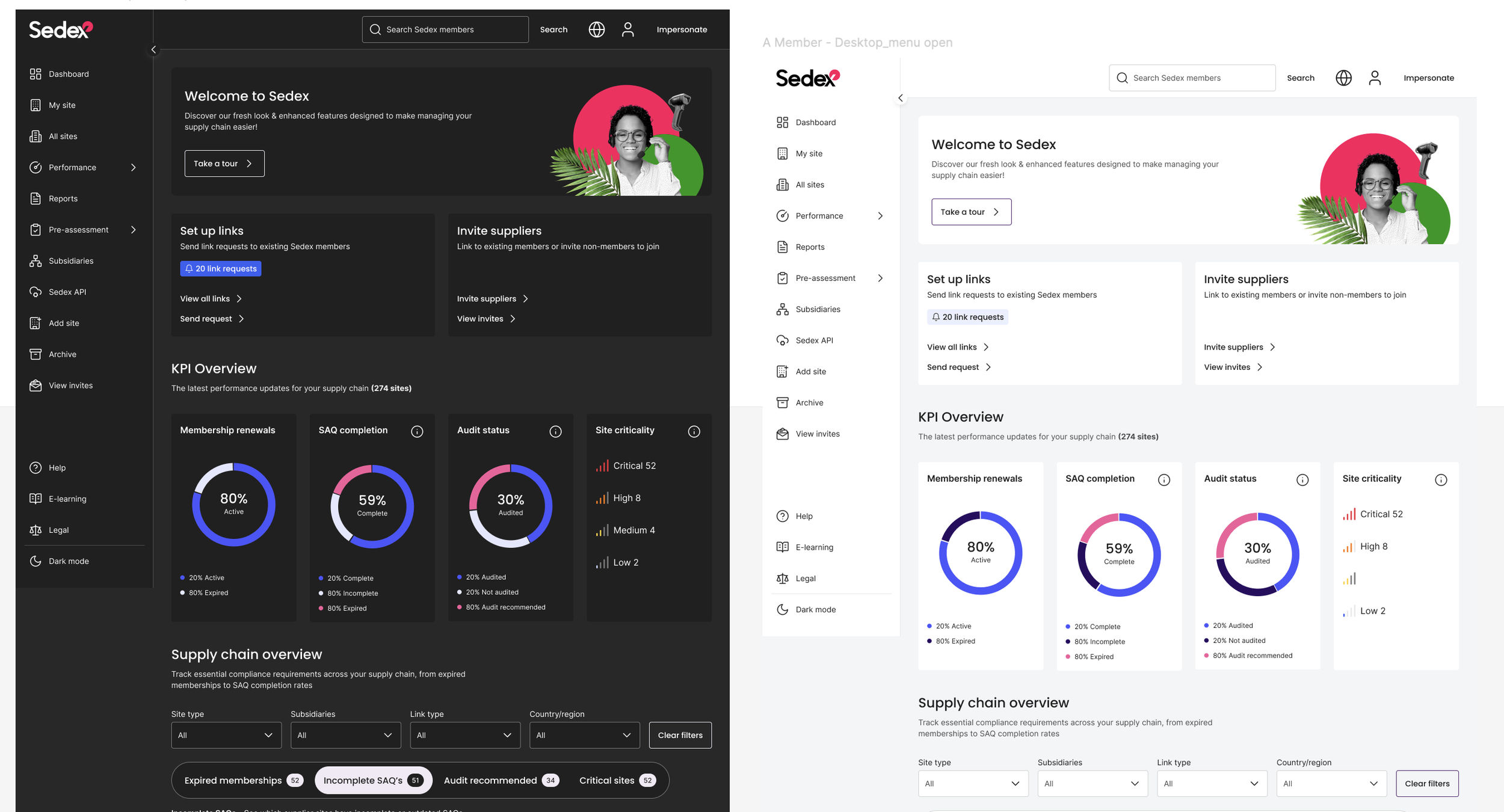
Brand alignment without compromise – Adopt the new Sedex brand while protecting semantic colour logic. Brand red was the main tension point and required careful handling to avoid clashing with error and warning states.
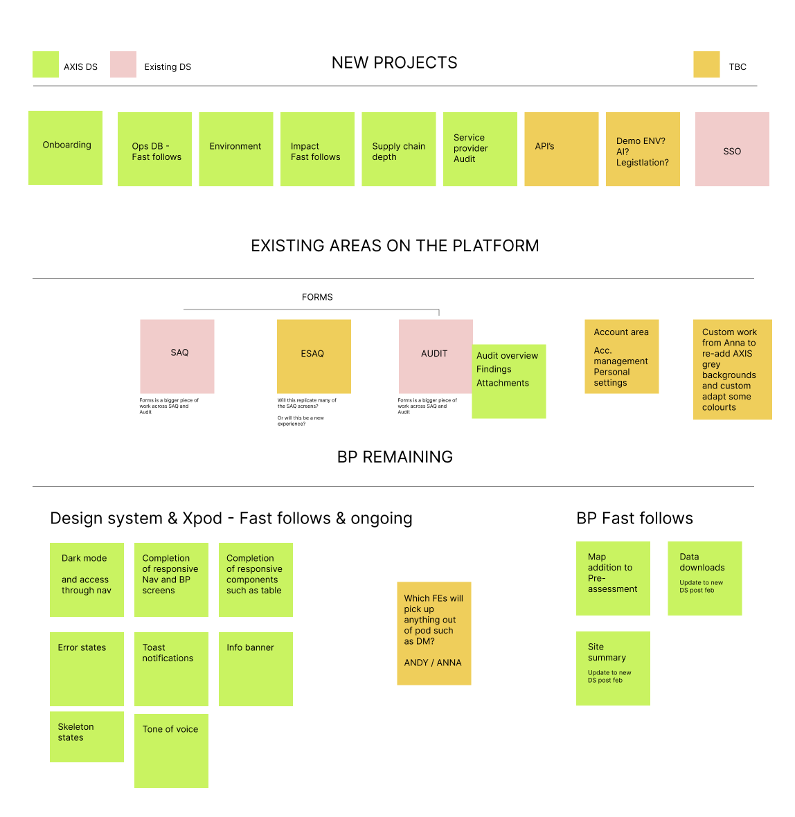
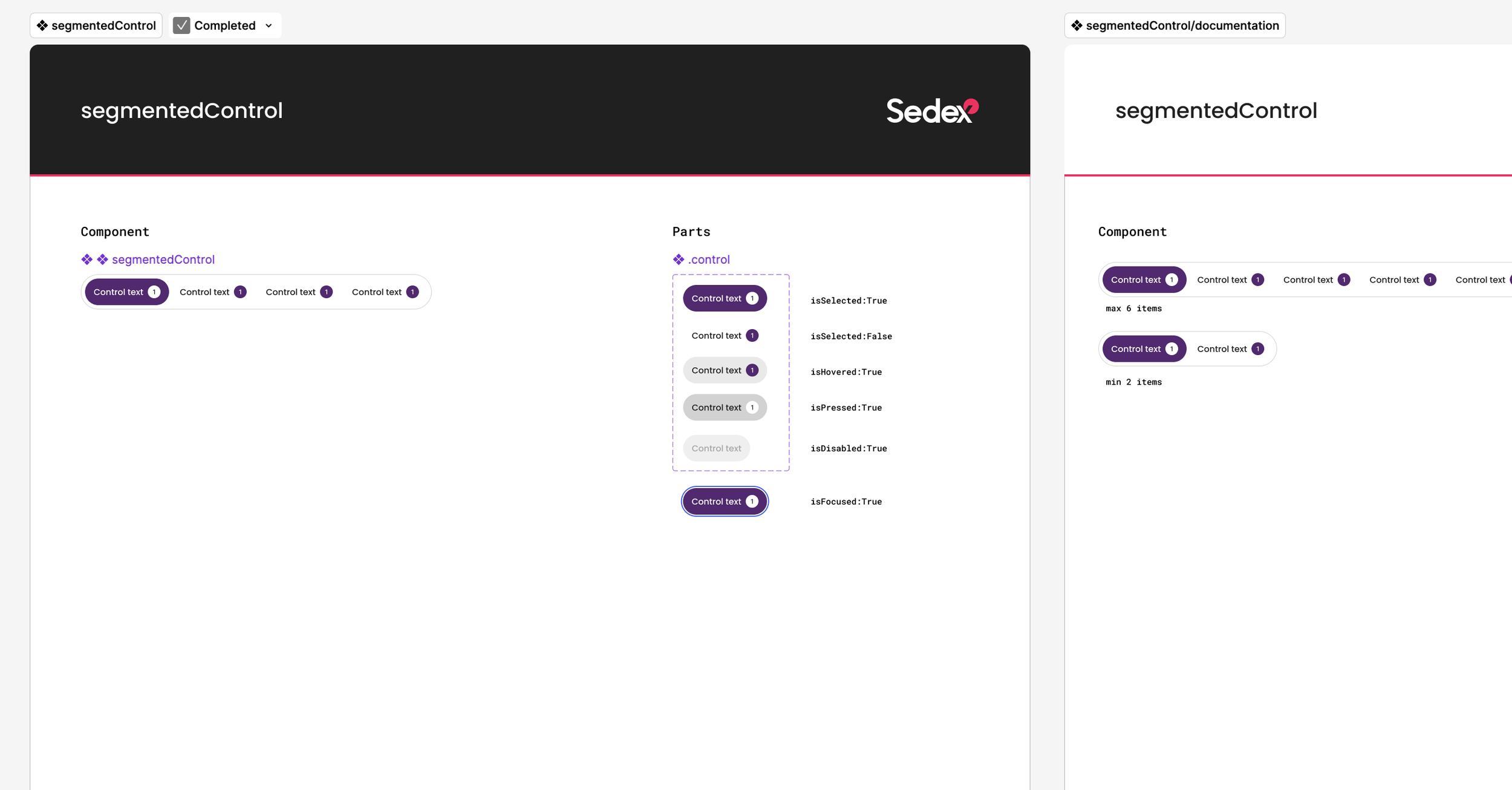
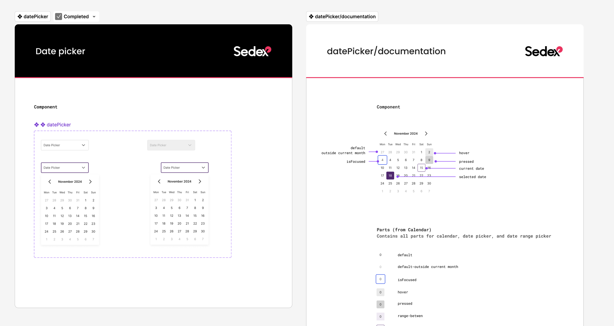
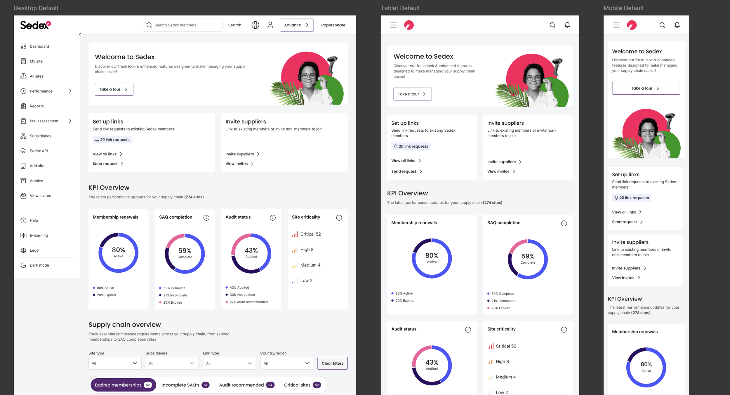
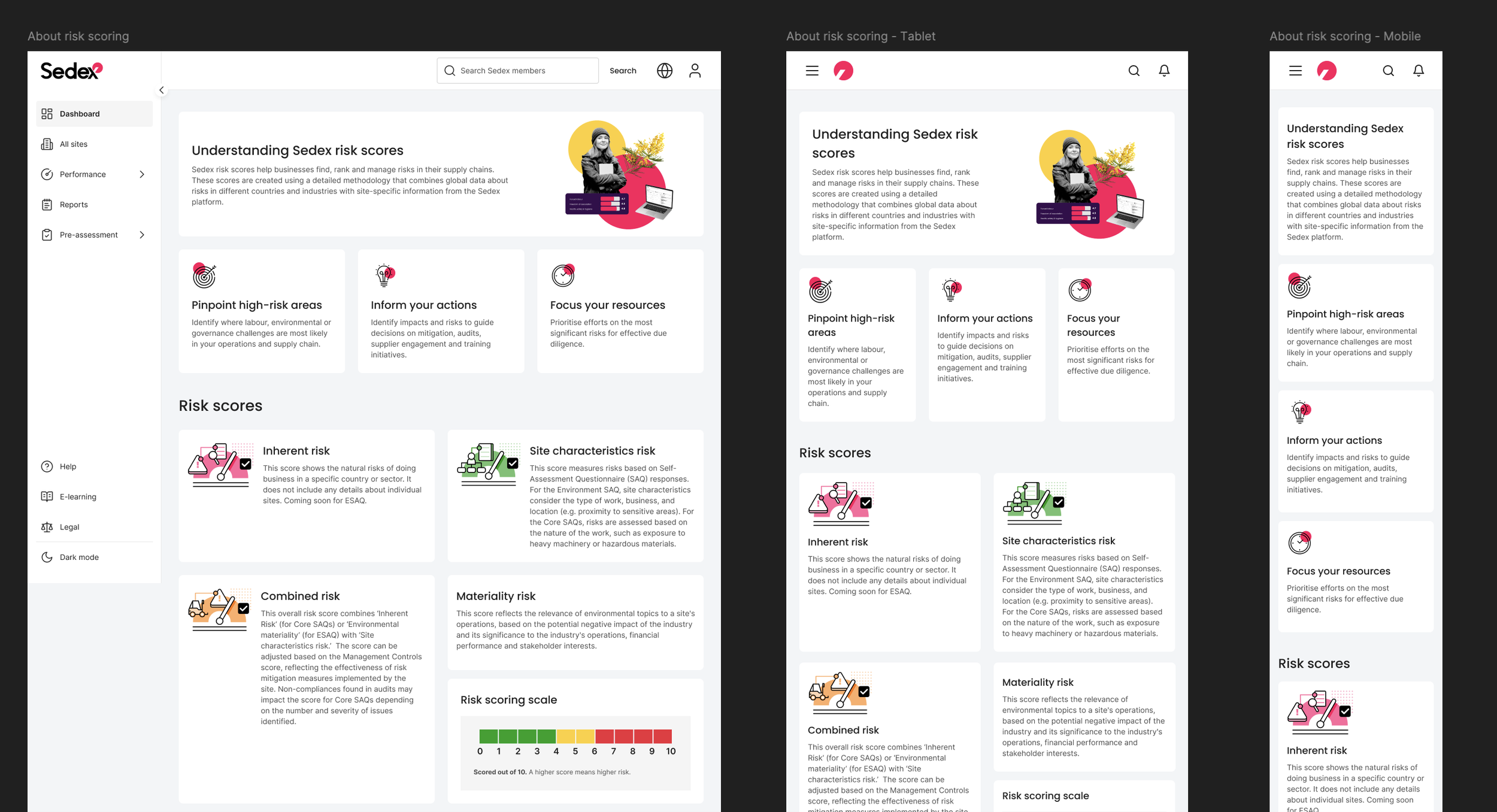
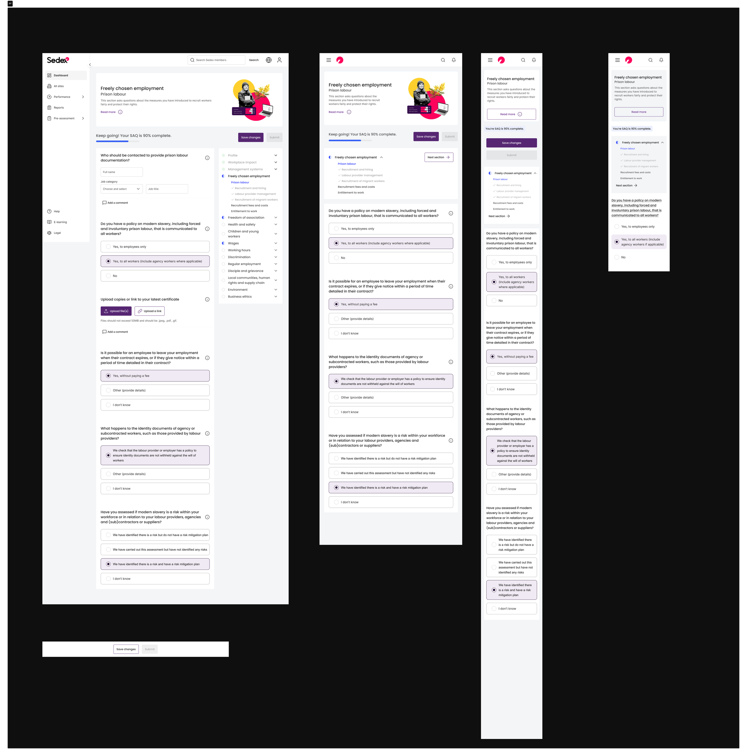
Responsive by default – Allow users to complete tasks efficiently across any screen size, with a phased rollout plan to bring legacy screens in line as initiatives allowed.
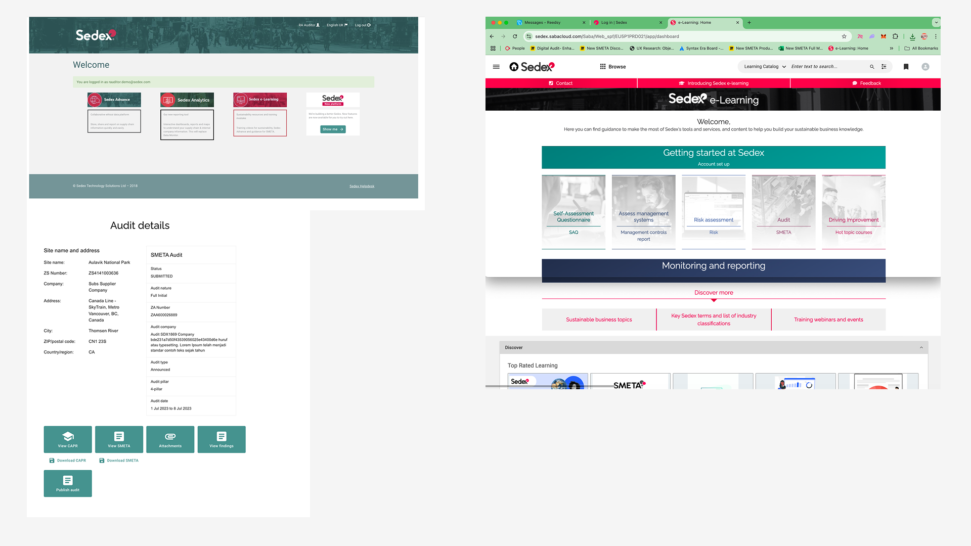
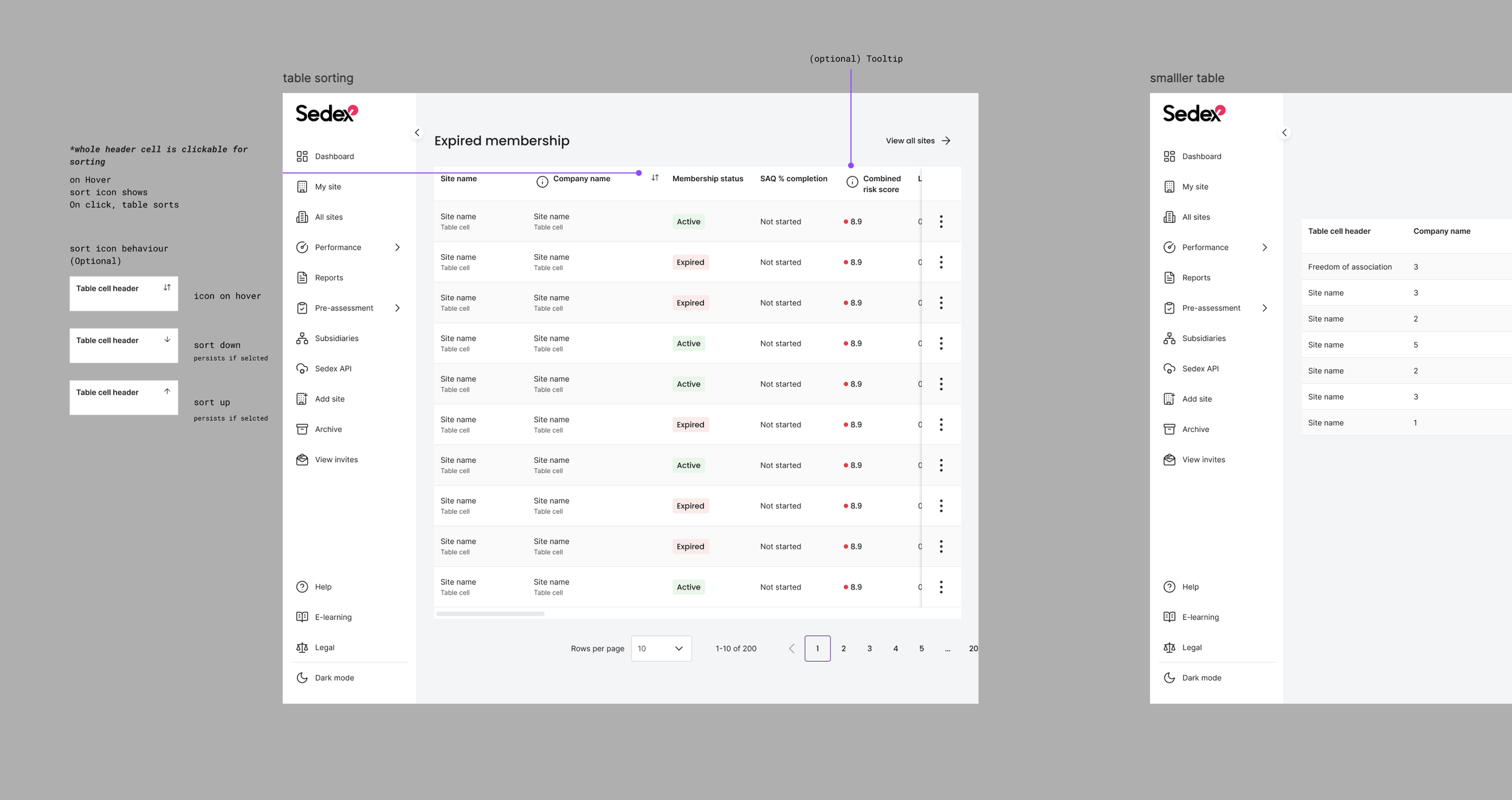
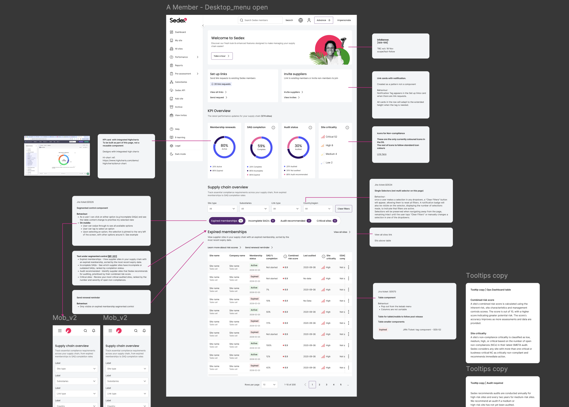
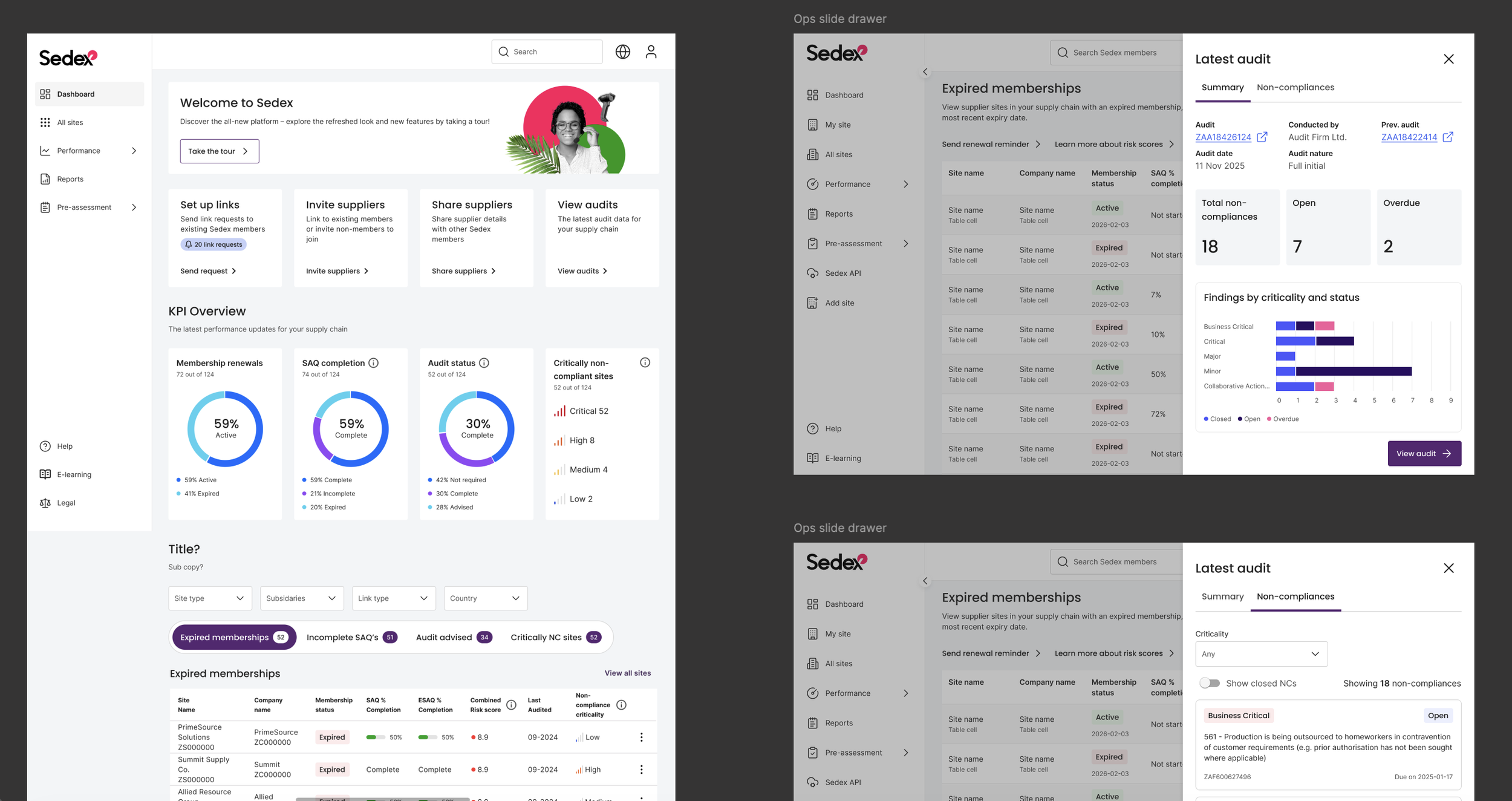
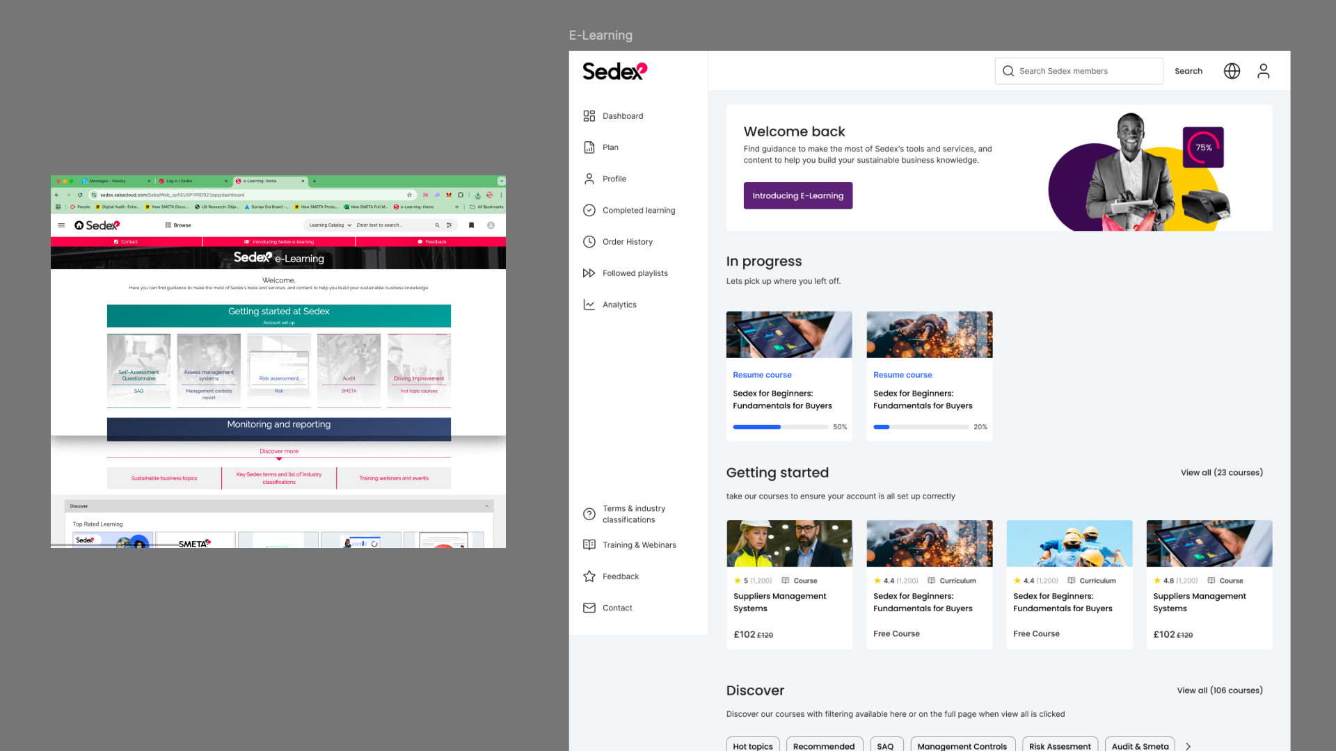
Surface what matters – Prioritise key information on the new dashboard and throughout, reducing the time users spent hunting for what they needed most.
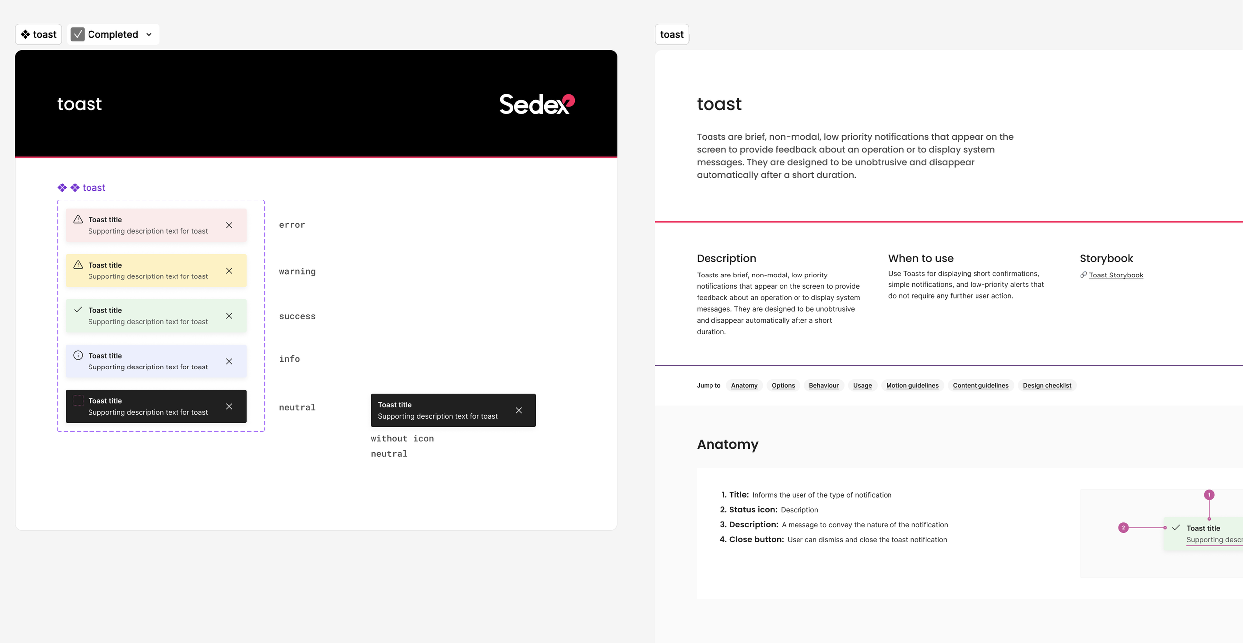
Clear, human language – The platform was dense with acronyms, technical jargon, and oversized tooltips that even long-serving employees struggled to parse. With customer staff constantly evolving, assuming institutional knowledge was never a safe bet. We introduced a clear language principle across every touchpoint — tooltips, banners, error states, Gainsight flows and beyond — with a voice that was authoritative yet approachable.
Faster data access – Make data downloads quick and intuitive. The previous experience involved waits of up to ten minutes.
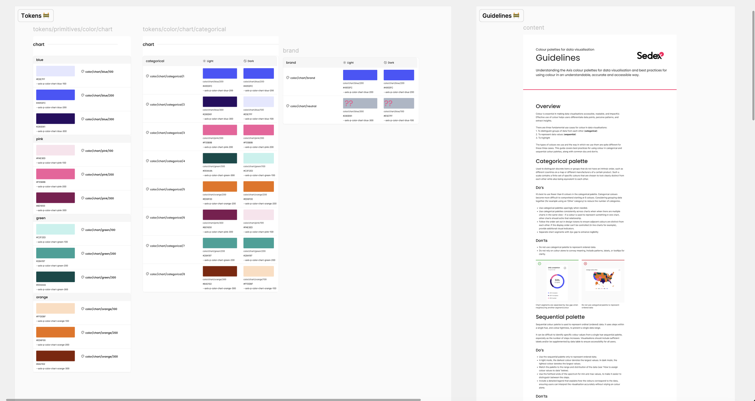
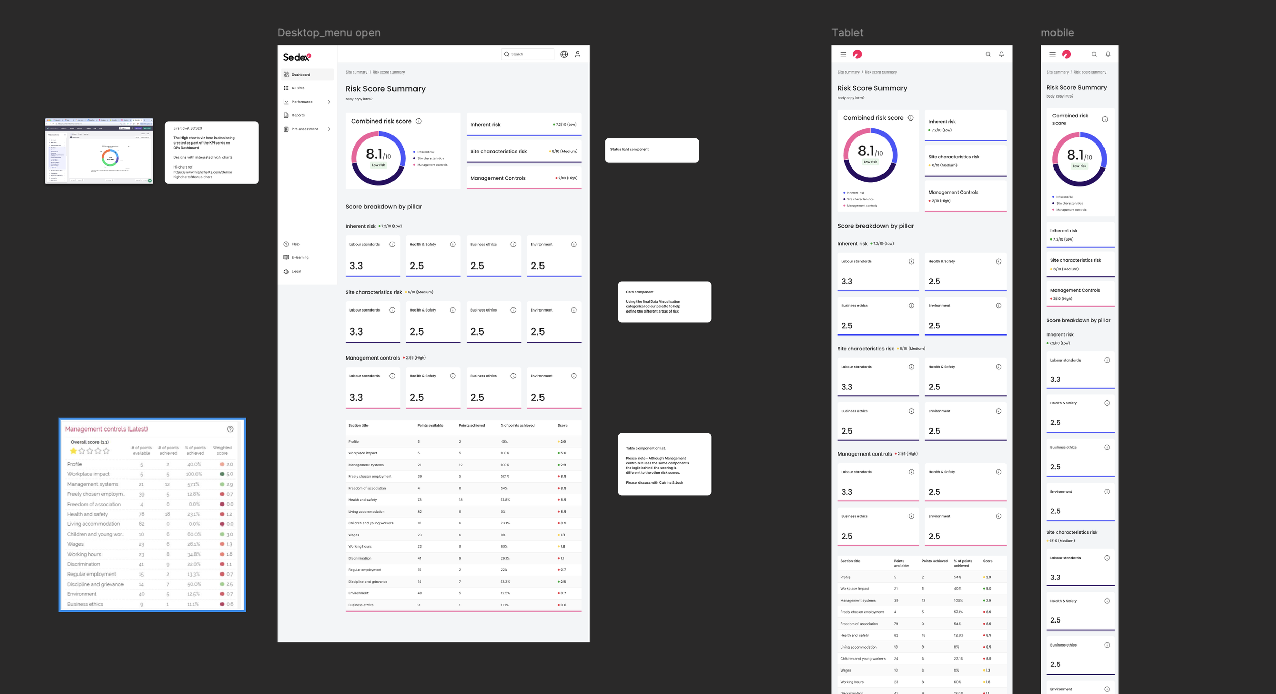
Integrated data visualisation – Replace Thoughtspot with our own data visualisation layer built through Highcharts, enabling us to close down a costly third-party dependency. Accompanied by comprehensive usage guidelines covering colour rules, chart selection for categorical and sequential data, and guidance for all teams working with data across the business.
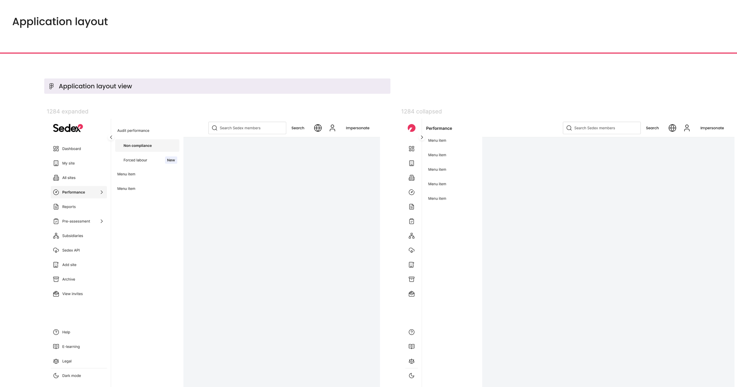
Smarter global navigation – Introduce a sidebar navigation tailored to individual user types without compromising screen real estate.
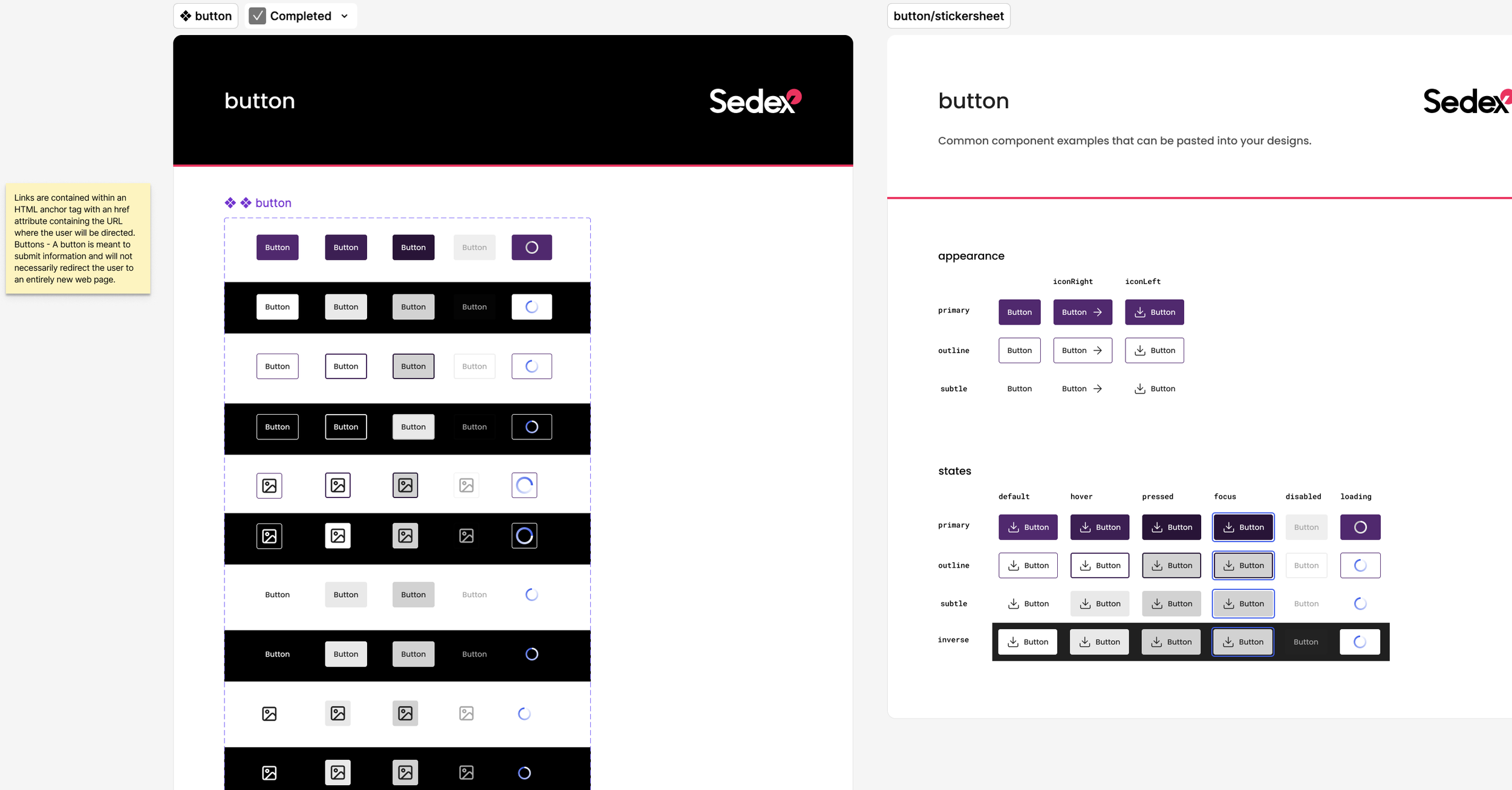
Micro animations – Bring moments of considered motion to reinforce actions, guide users, and add a layer of craft to the experience.
WCAG 2.1 / EAA compliance – Full adherence to European Accessibility Act standards across colour contrast, keyboard control, and beyond.
Guided onboarding and intuitive patterns – Support users through their first experiences with Gainsight-powered onboarding flows and contextual tooltips, clear signposting throughout, and UI patterns grounded in consistency and familiarity. By reducing unnecessary choice and leveraging recognisable conventions – Hick's Law in practice – we lowered cognitive load and helped users find their footing faster.