Embarking on a transformative journey for the Guinness Storehouse website, from pitch to final product, our team set out to redefine the digital experience synonymous with the world-renowned brand. Faced with the challenge of revitalising an iconic destination's online presence, the case study delves into our comprehensive design overhaul. From immersive visuals that echo the heritage of Guinness to intuitive navigation alongside our strategic making and user-centric design principles that underpinned our vision for the transformation.
Client:
Diageo
Project:
Guinness Storehouse digital transformation
www.guinness-storehouse.com
The Pitch
Background
We were tasked with pitching for the digital transformation of the Guinness Storehouse website. The challenges included bringing the Guinness ‘magic’ to the new platform, boosting user engagement, and simplifying the booking process. The design needed to be robust to re-use across the DIAGEO ecosystem and partner brand sites. Analysing available data and feedback revealed the need for a visual refresh, improved information architecture, intuitive booking options, and opportunities for upselling. Additionally, we were asked to explore digital development possibilities for the Guinness Storehouse's archives.
Research
Research data was constrained in the initial pitching stage, but highlighted user experience and upselling challenges. User types encompassed overseas travellers, UK/European users booking a few days before, and walk-ins on the day. Issues identified included a non-intuitive booking system, inflexibility in building packages, and a complex process for walk-ins. Additional problems on the existing site included:
Navigation Complexity: Users found it difficult to navigate the site efficiently.
Limited Customisation Options: The booking system lacked options for users to personalise their experiences.
Cross-Selling Difficulties: Challenges existed in cross-selling products within the booking journey.
Inability to Bundle Products: Certain items, such as personalized pint glasses, couldn't be added to the basket along with a booking.
Low Ticket Sales Momentum: The system struggled to boost ticket sales before the scheduled day.
Underutilised Archives: Opportunities to monetise the Guinness Archives were not effectively explored.
Narrow Demographic Appeal: The site faced challenges in attracting a diverse demographic beyond traditional beer enthusiasts, including younger audiences, more female groups, couples, and families.
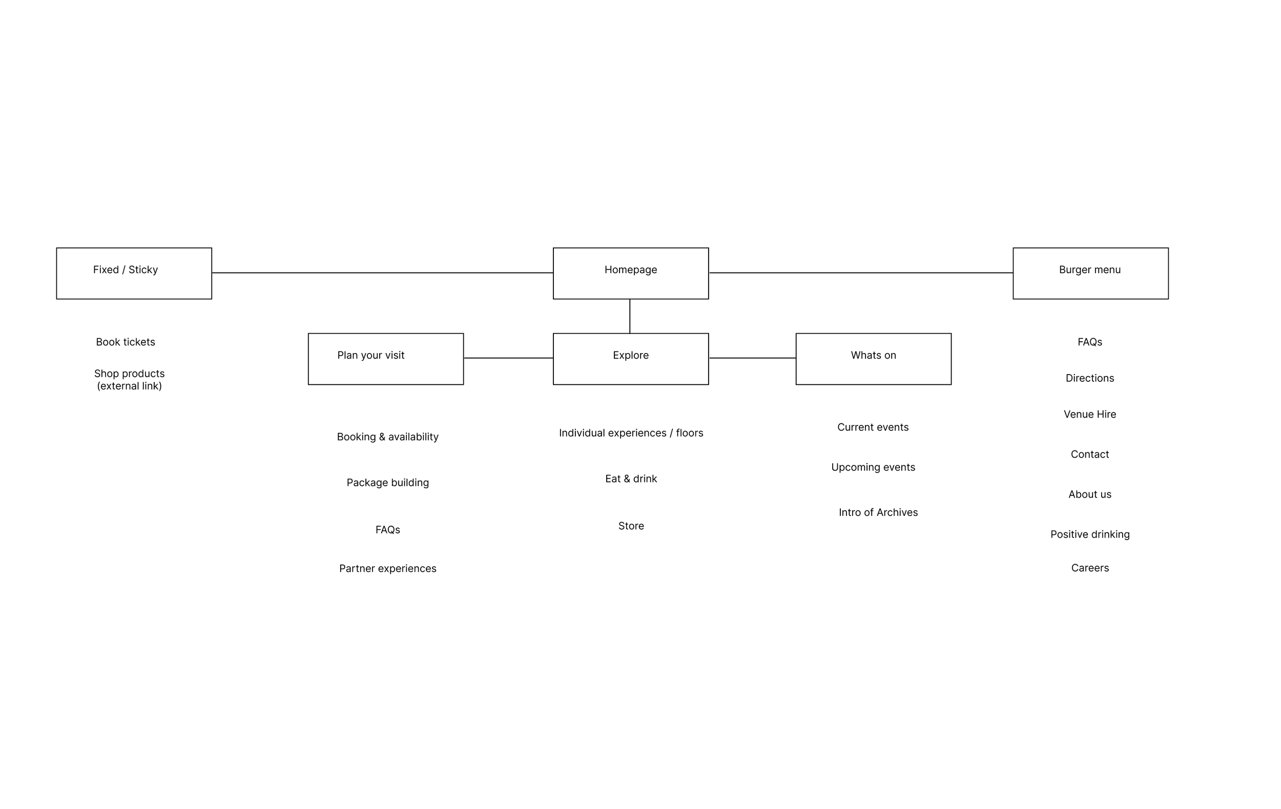
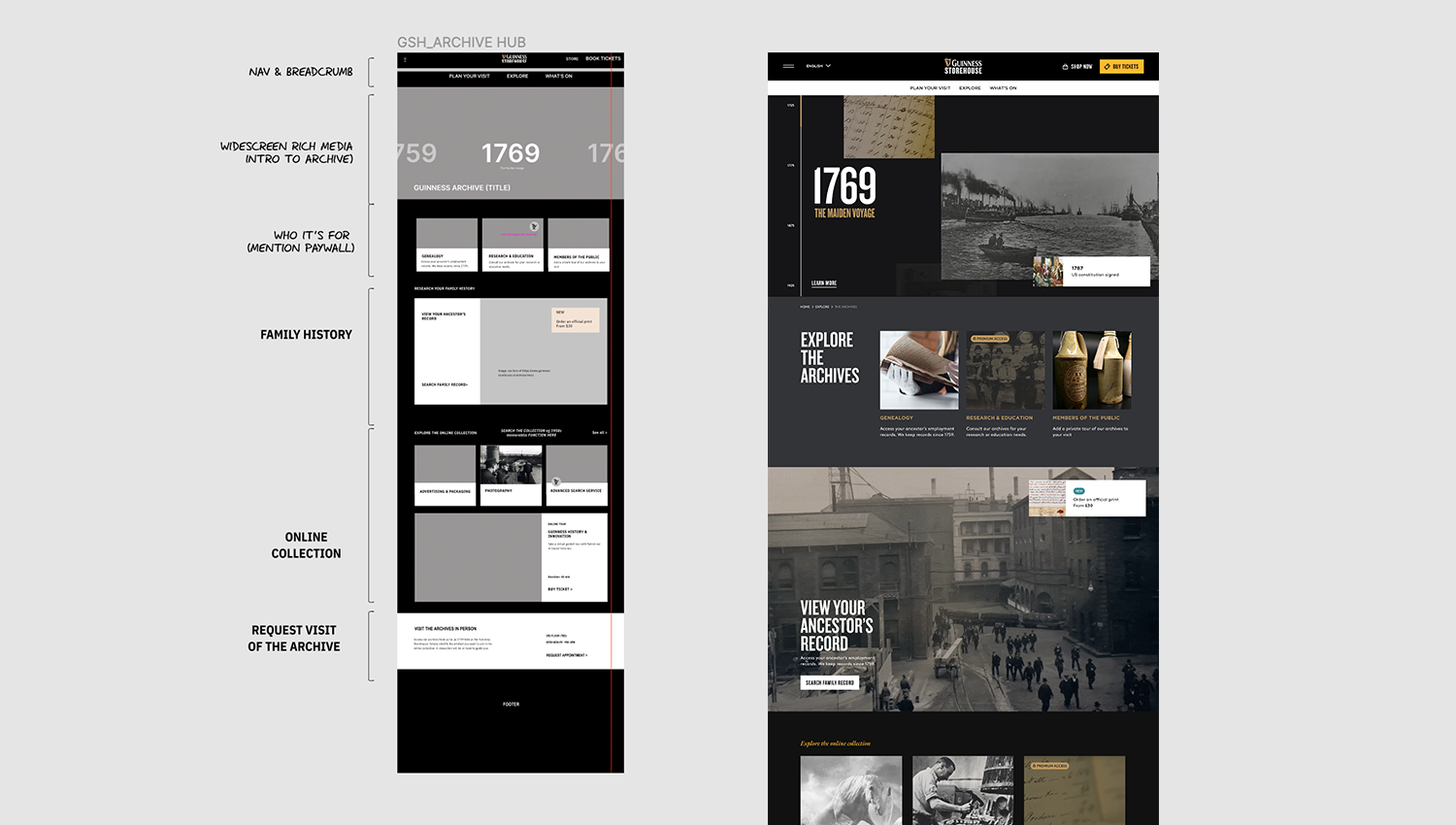
Information Architecture
We streamlined the existing site's IA, addressing years of confusion due to misplaced and duplicated content. Our solution focused on user needs, simplifying the navigation menu to three key sections: "Plan Your Visit," "Explore" and "What's On."
Without stakeholder collaboration at this point we focused on the following:
User-Centric Focus: Our information architecture decisions were rooted in a user-centric approach, prioritising the most crucial information for visitors. By aligning with user needs, we aimed to create an interface that intuitively caters to their preferences and expectations.
Efficient Content Organization: The revamped information architecture efficiently organises content, alleviating confusion that may have arisen from misplaced or duplicated information. This ensures that users can swiftly locate the information they seek, contributing to a smoother and more efficient user journey.
Enhanced User Experience: With a simplified navigation structure and clear calls-to-actions, our design decisions were geared towards elevating the overall user experience. Users can now navigate the site with ease, enjoying a more intuitive and enjoyable interaction that aligns with their goals.
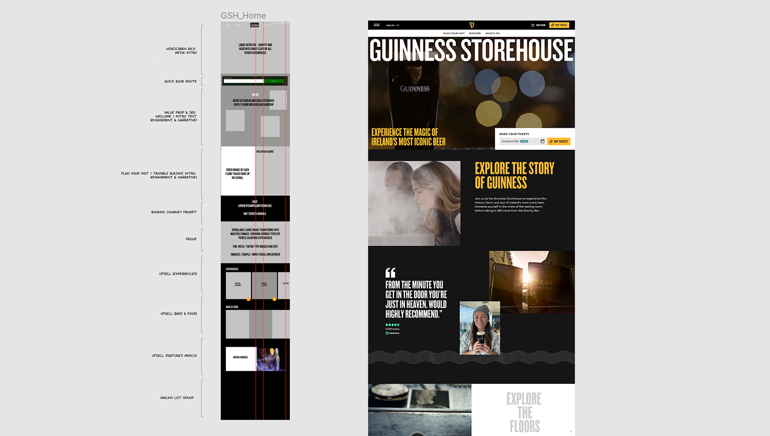
Wireframing
During the wireframing phase for the three pivotal sections—the homepage, individual experience ('The Stoutie'), and the booking process—our focus was on enhancing clarity and functionality. Simultaneously, we integrated opportunities for infusing moments of Guinness magic into the designs, ensuring a seamless blend of practicality and captivating user experiences.
The wireframes carefully incorporated our fundamental UX principles, including the integration of social proof, strategies for upselling experiences and products, and ensuring swift access to the booking journey. Emphasising a seamless user experience, we sought to not only streamline the practical aspects but also inject moments of magic throughout the designs. This approach aimed to create an engaging and memorable interaction for users, aligning with the overarching goal of providing a user-friendly and enchanting visit to the Guinness Storehouse website.
Design guidelines
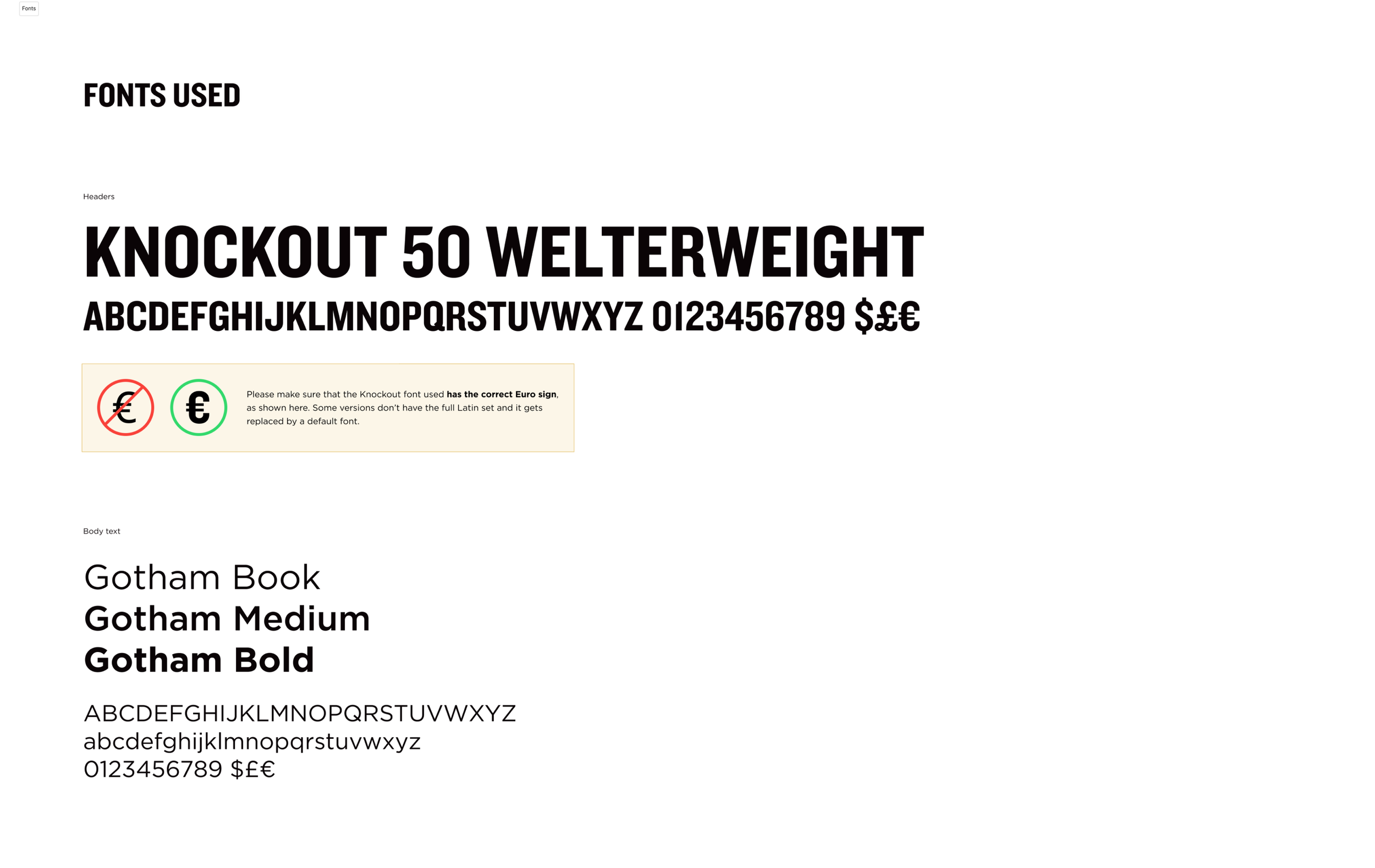
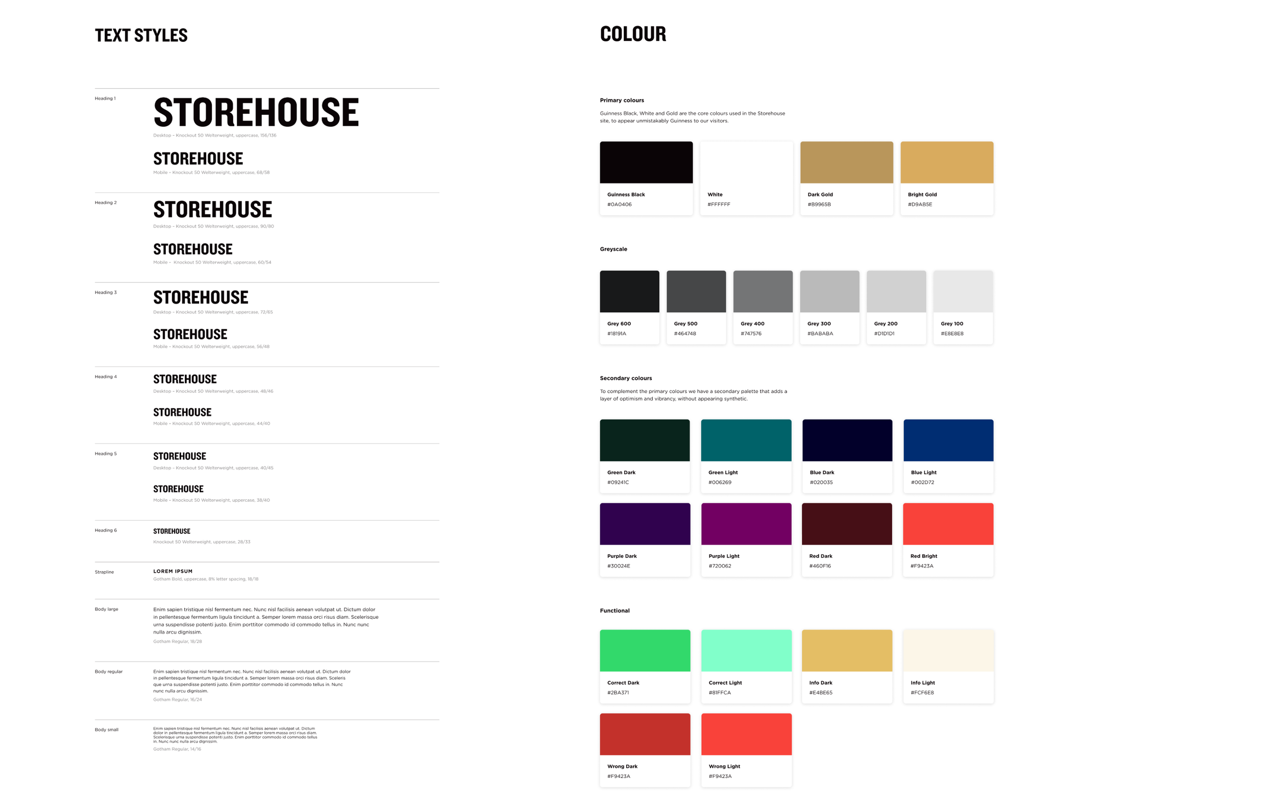
In the absence of stakeholder input, we chose to adhere closely to the established Guinness brand guidelines. Although uncertain about the extent to which these guidelines could be stretched for the unique ambiance of the Guinness Storehouse, we aimed to maintain a distinctive look while staying within the broader framework of the Guinness brand. By implementing brand fonts and colour palettes, we simplified the design by removing intricate details and patterns. Instead, we leveraged interactions strategically to deliver moments of joy for the user experience.
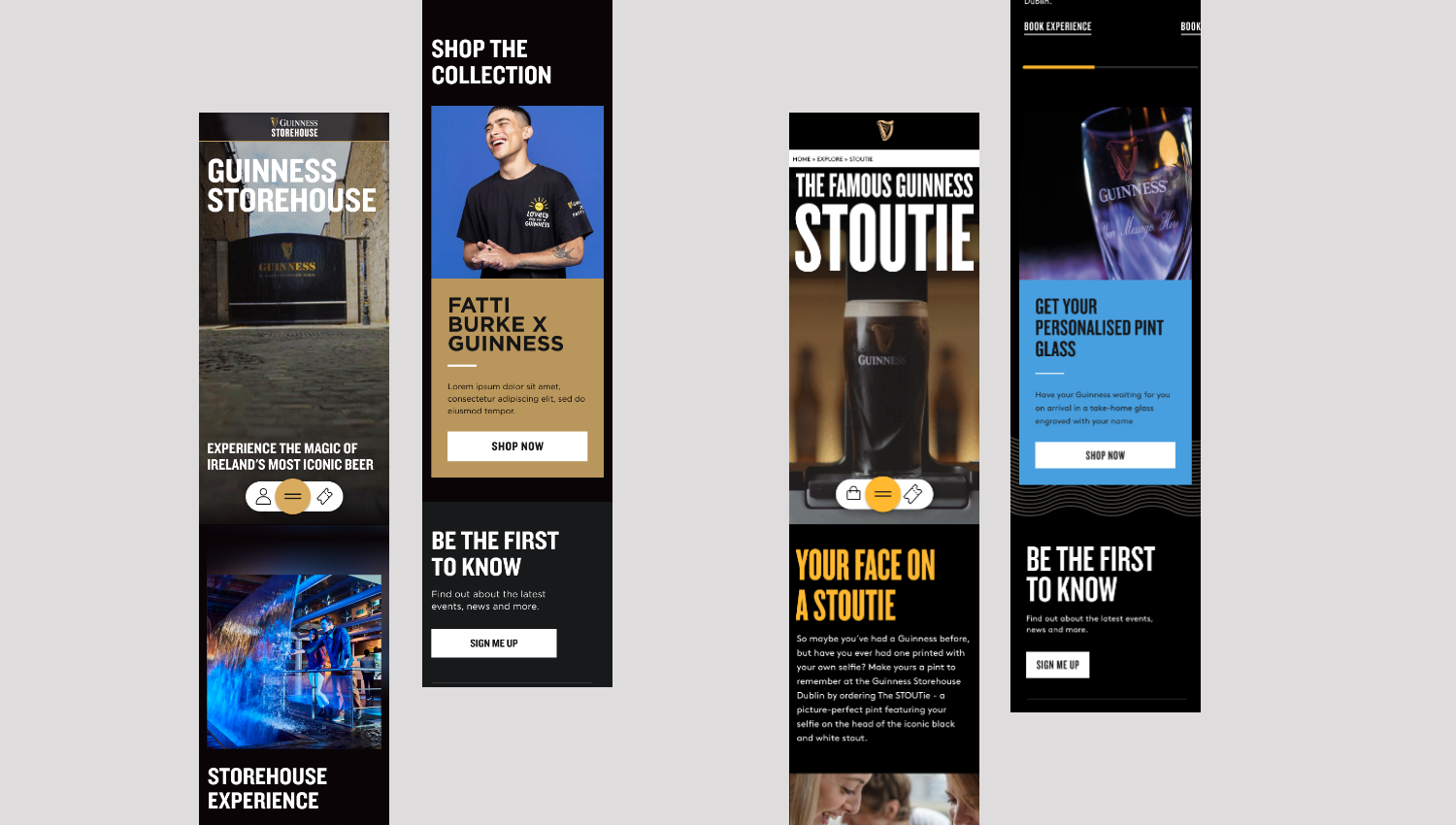
Content principles
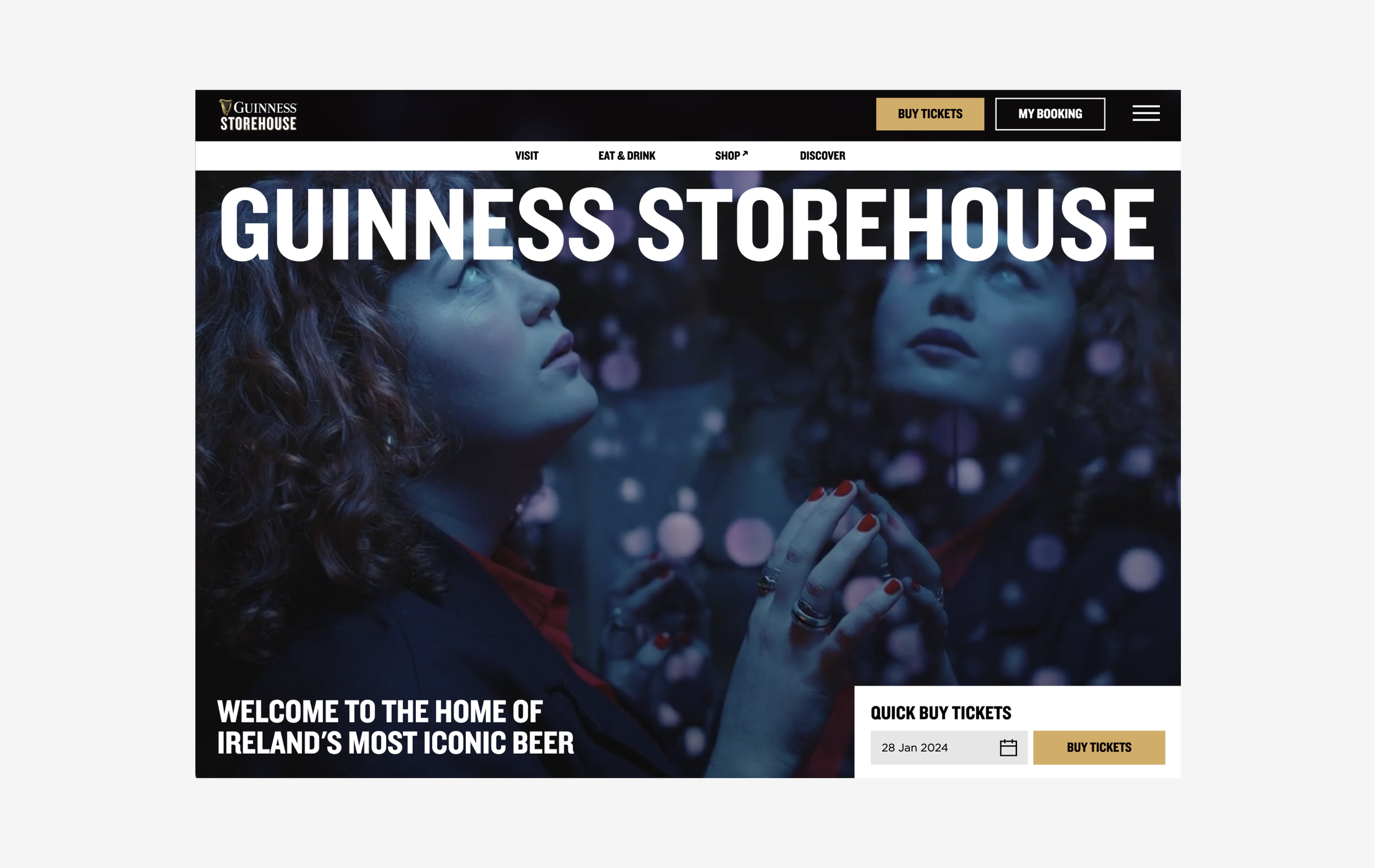
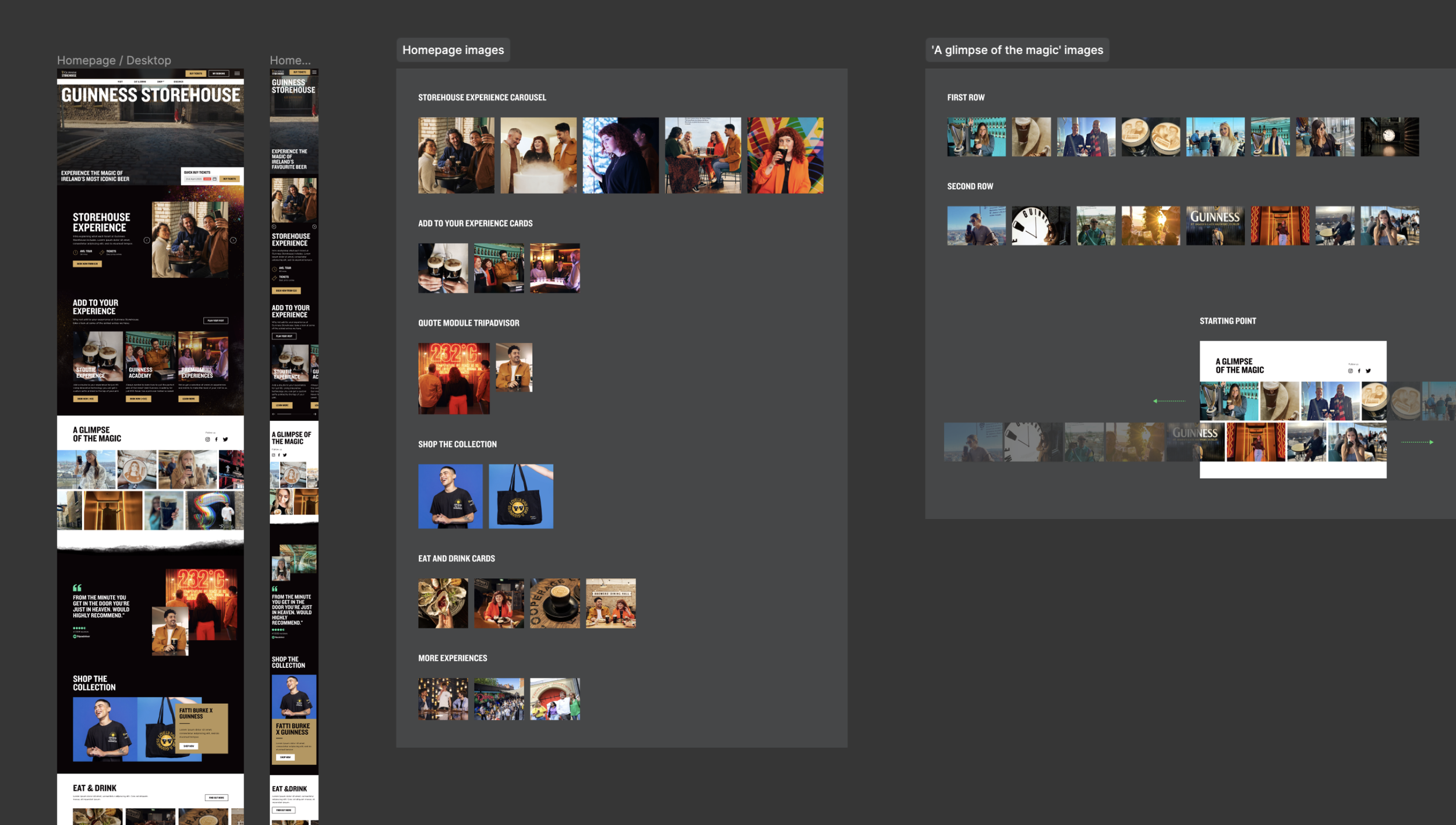
The existing imagery felt dated, featuring vacant beer halls and experiences that failed to capture the emotional joy of the overall experience. Our response was to establish content principles, guiding our selection of images and videos. Rather than emphasising the vastness of spaces through emptiness, we focused on portraying diverse individuals relishing their experiences. For iconic spaces like the bustling Gravity Bar, we showcased them in a lively and vibrant atmosphere. Video footage, employed in short, dynamic, social-style edits, aimed to provide users with a tantalising glimpse of the magical experience without revealing it in its entirety.
Technical Considerations
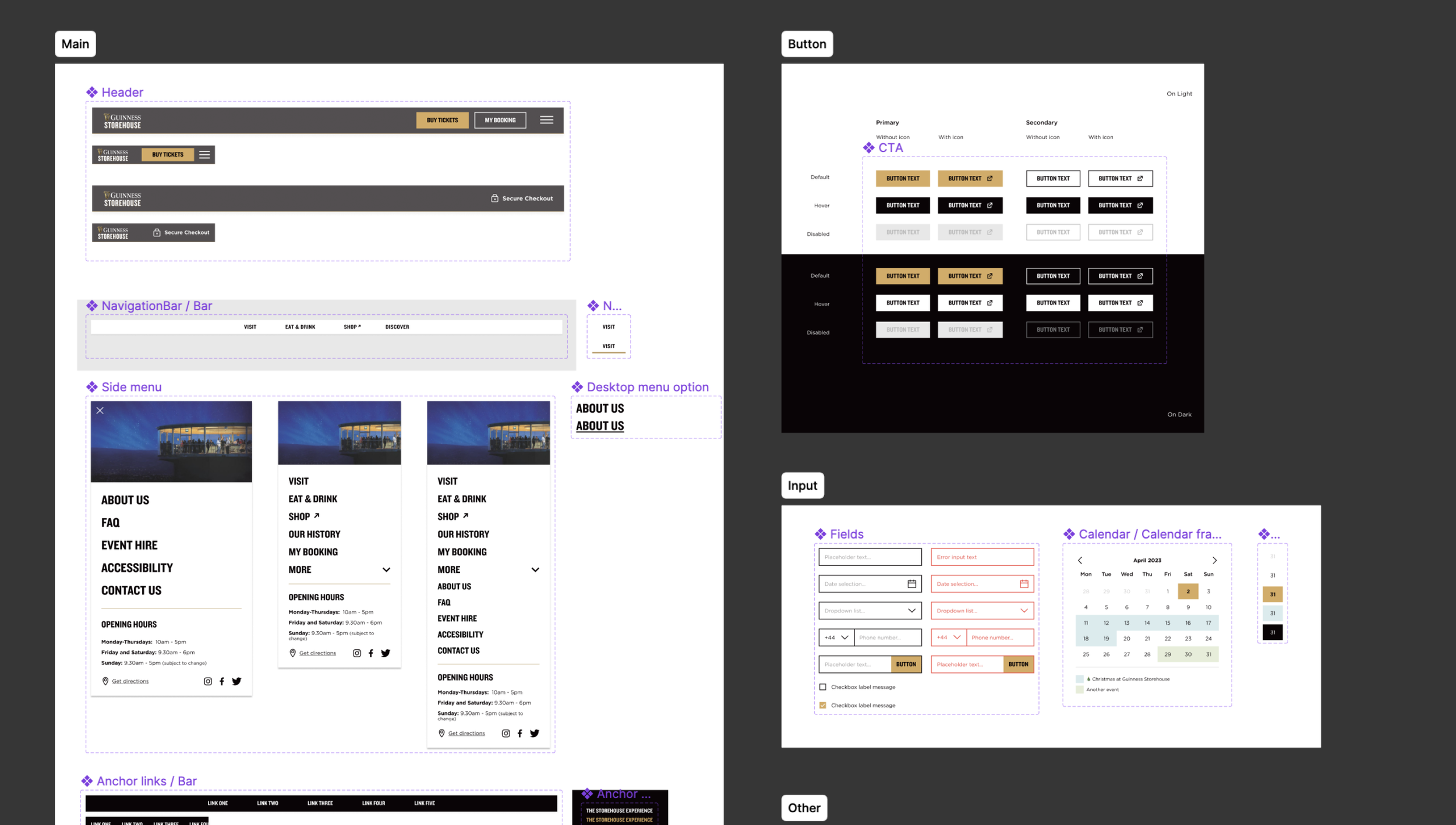
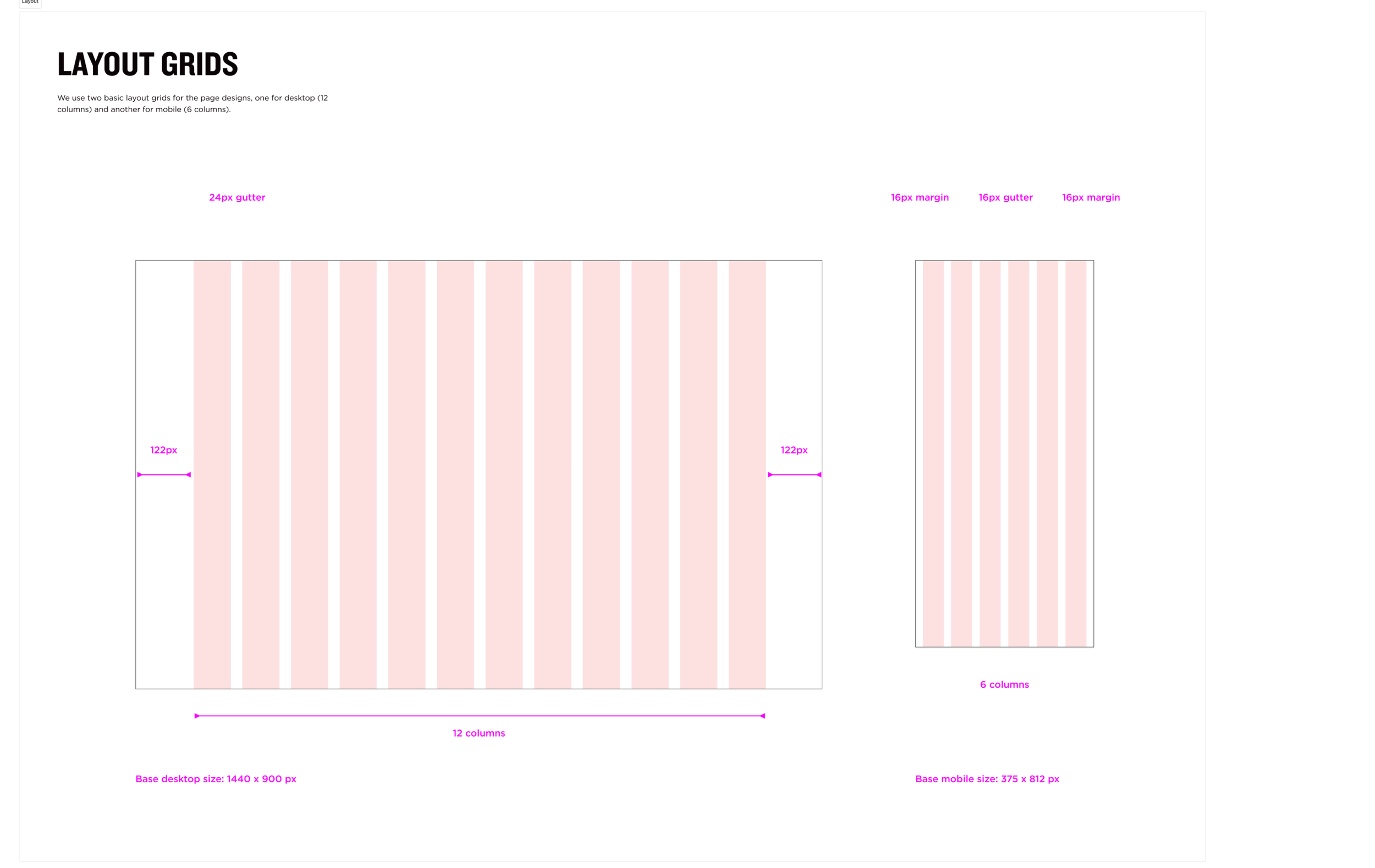
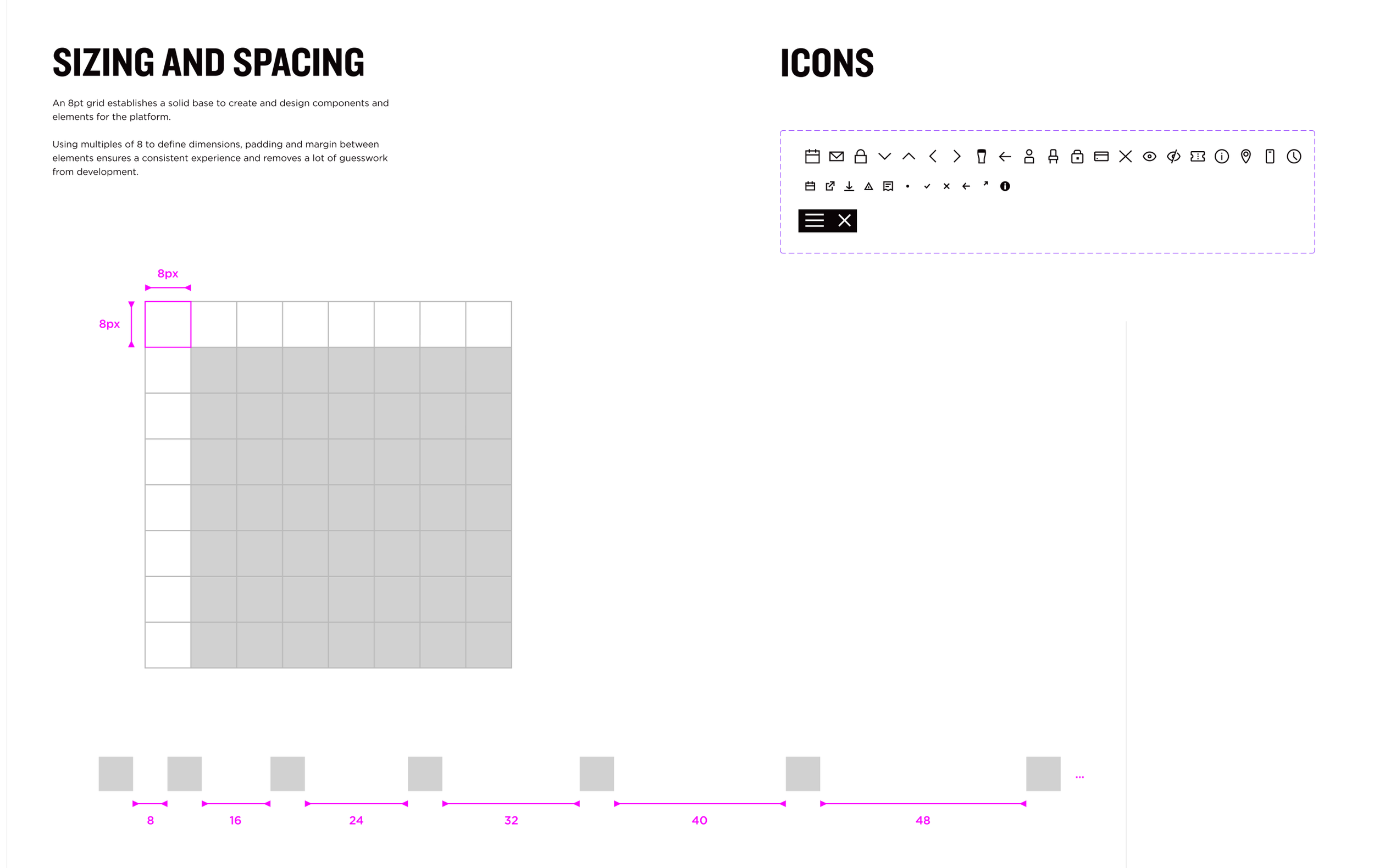
The project brief emphasised the necessity of reusing designs across multiple platforms within the portfolio, requiring a modular approach. To address this, I consistently considered modularity throughout the design process. Content was crafted in modules designed to serve a dual purpose. Firstly, it ensured responsiveness across both desktop and mobile interfaces. Secondly, this approach facilitated the seamless repurposing of designs for use across various platforms within the project portfolio.
Moments of ‘Magic’
We contemplated ways to translate the unparalleled experience of the Guinness Stroehouse physical experience onto the digital platform, aiming to provide users with a ‘taste of the magic’ while preserving the overall experience. Through strategic integration of technology and interaction into the design process we created:
An augmented reality (AR) filter was introduced for the Stoutie experience, enabling users to practice and share poses before their actual visit.
We explored an innovative concept for virtual Guinness product shopping, allowing users to explore Storehouse merchandise and add items to their basket seamlessly.
Intrigued by the distinct individual experiences on each floor of the physical Storehouse, we sought to replicate this in the digital realm.
For the Archives, an interactive timeline was designed to captivate and engage users.
On desktop, hover interactions were implemented, bringing static imagery of unique spaces to life through brief video footage, enhancing the overall user experience.
Result - Pitch Win
‘We were incredibly impressed with everything you crafted, especially considering the limited data and research available. Your streamlined navigation aligns perfectly with our vision, offering a refreshing departure from years of patching and fixes to accommodate the site's lack of flexibility.
The exploration of the booking process excites us, particularly your thoughtful consideration of various user types and how their experiences can be enhanced.
Most notably, the design captures the moments of magic flawlessly. From the engaging floor exploration module to the dynamic hover states that breathe life into spaces, the designs radiate energy and delight. Your work not only aligns seamlessly with our brand guidelines but also demonstrates a keen understanding of reusable modules, making it a perfect fit for our objectives.’
POST PITCH WIN
Refinement of the style guide and design system
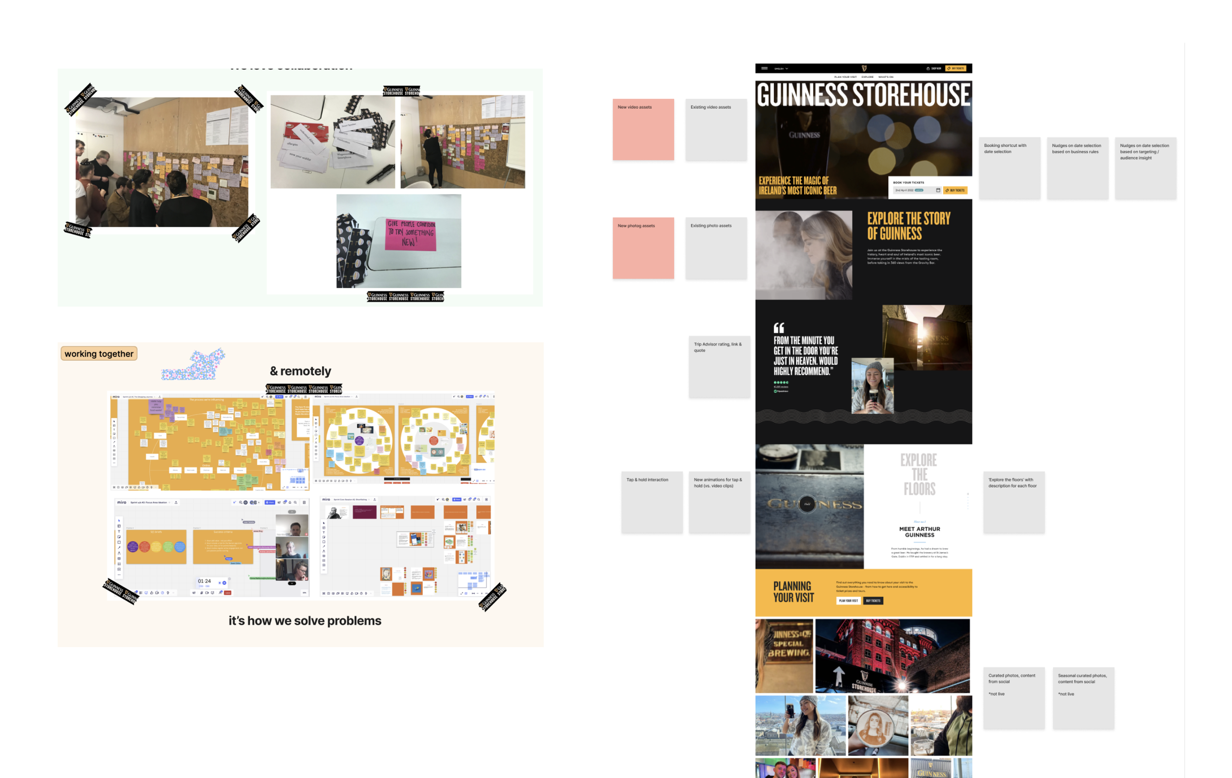
Following the successful pitch, we commenced a collaborative effort with Diageo's design system. Initially, we conducted a thorough comparison of our designs with Diageo's components library, aiming for a seamless integration. We identified areas where our designs could align with existing components without compromising user experience. Simultaneously, we maintained the flexibility to design new components that were essential to our flows and adhered to our user experience principles.
Every Friday, we convened for a collaborative session involving the Diageo design system team and external partners responsible for building products. During these sessions, we presented the newly developed components, evaluating their potential integration and problem-solving capabilities for other builders in the process.
Booking Journey UX
2 week agile sprint:
Myself, Head Of Product Design (Profero), Scrum Master (Profero), Product Designer (Profero), Product Manager (Diageo), BA (Diageo), Developers (IPG Tech team)
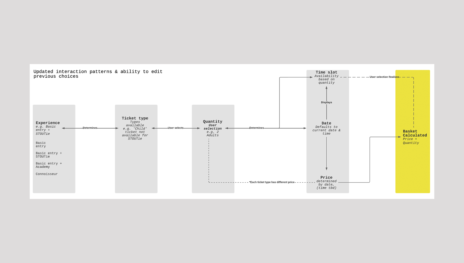
Userflows
- Designing userflows
- User Testing
- Iterating based on feedback from testing and the Diageo BA & PM
User Research key takeaways
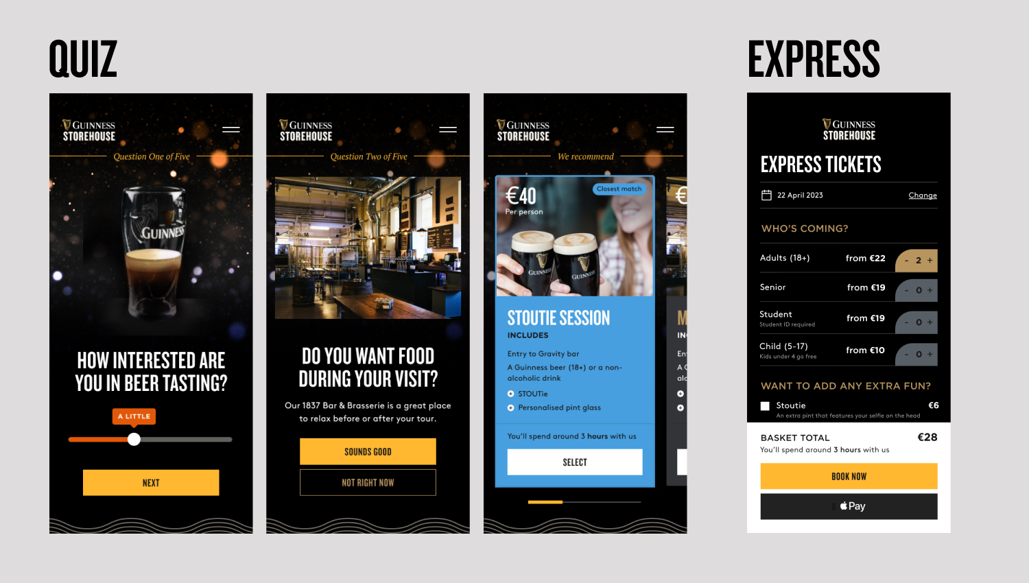
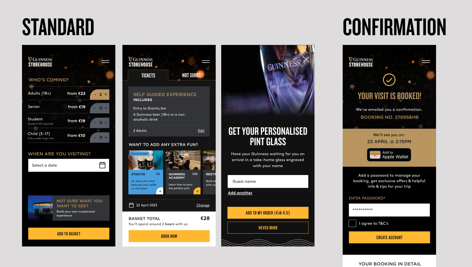
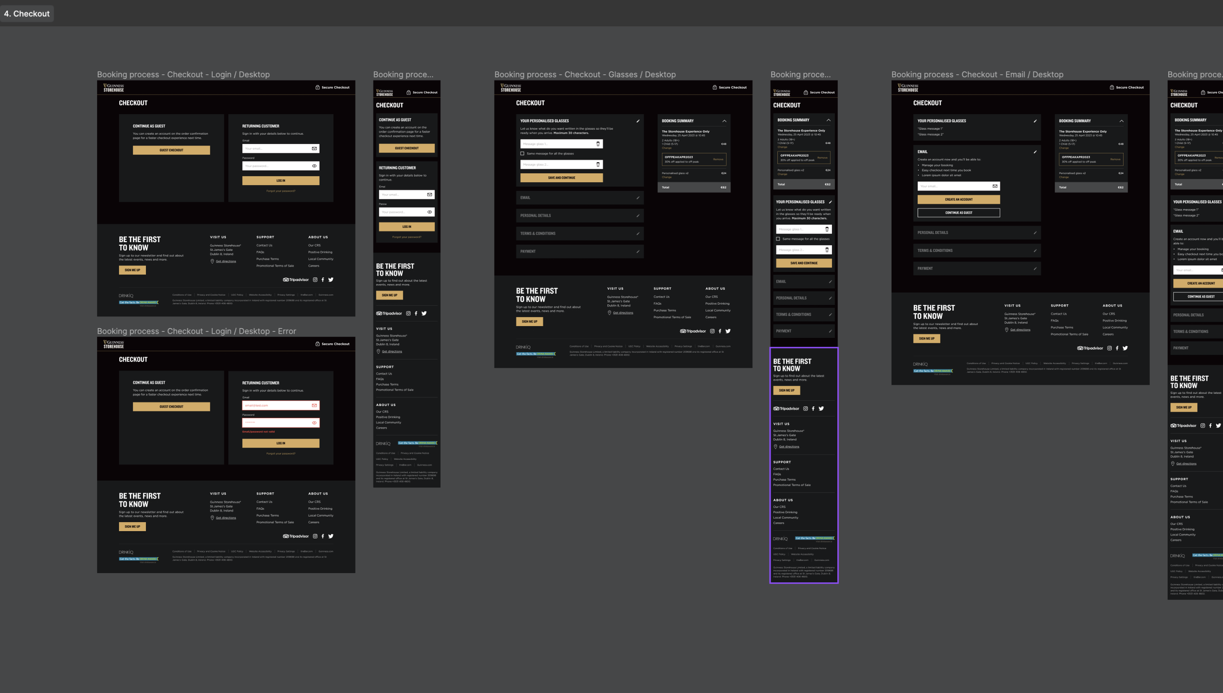
- User has a strong need for flexibility to amend bookings - this currently stops people from booking early and ultimately not going to the experience
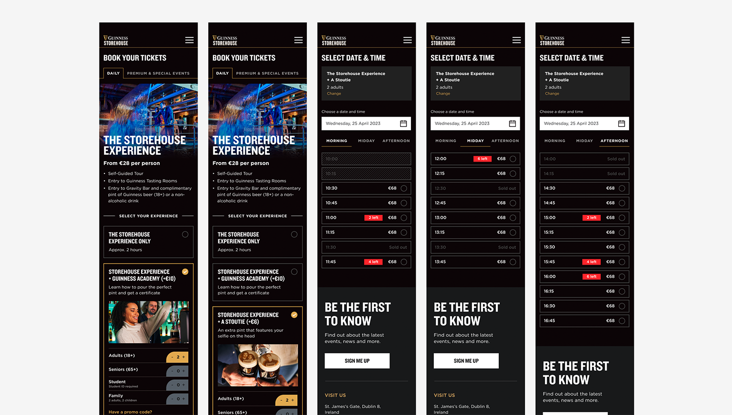
- User wants to build their own bespoke package experiences (current functionality doesn't allow this and bundle packages are limited and confusing)
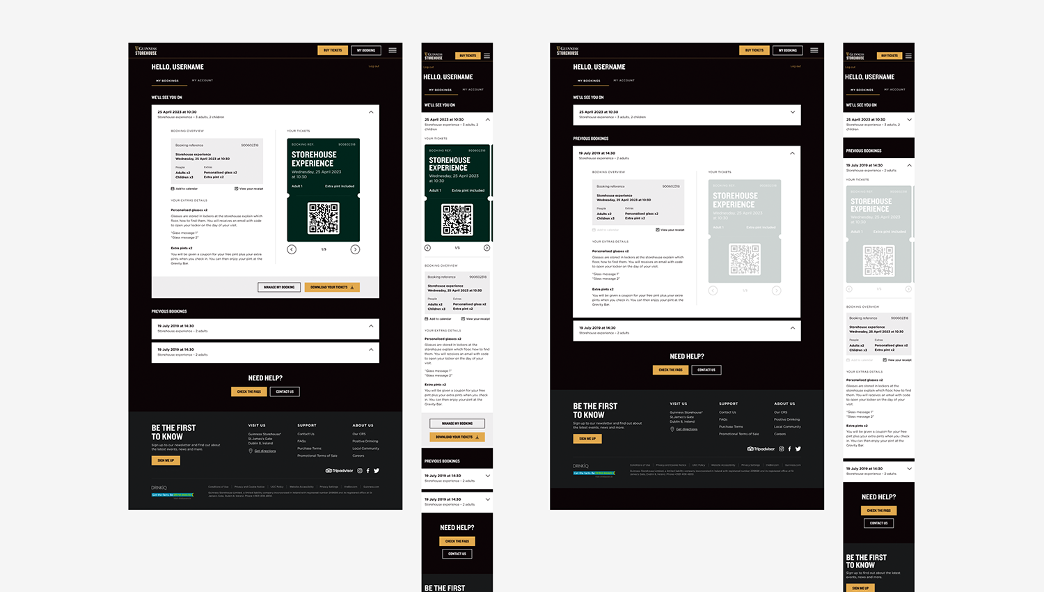
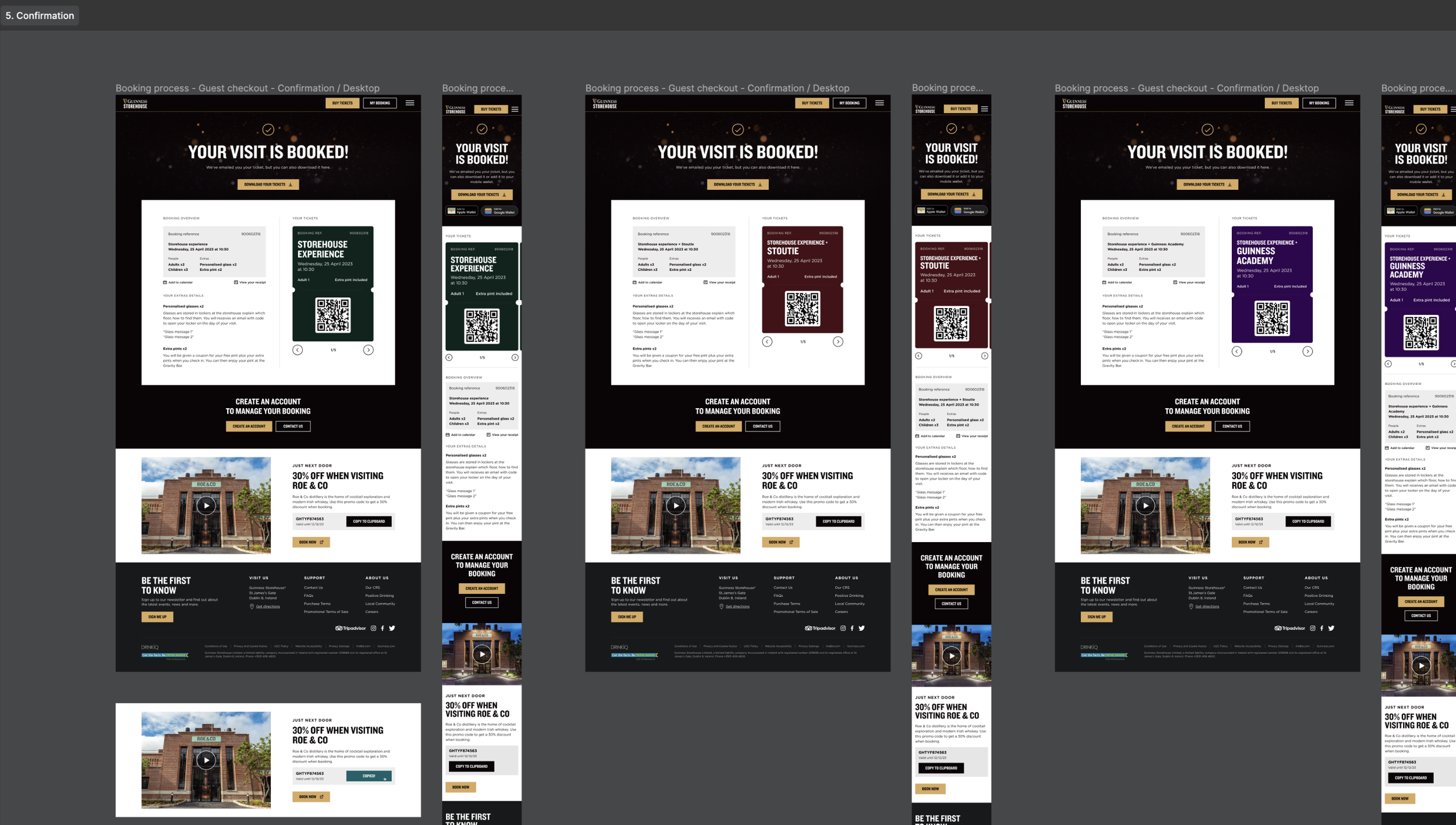
- Ability to receive Booking tickets in a way they can screen grabbed alongside a download able PDF (not just a downloadable pdf)
Business needs
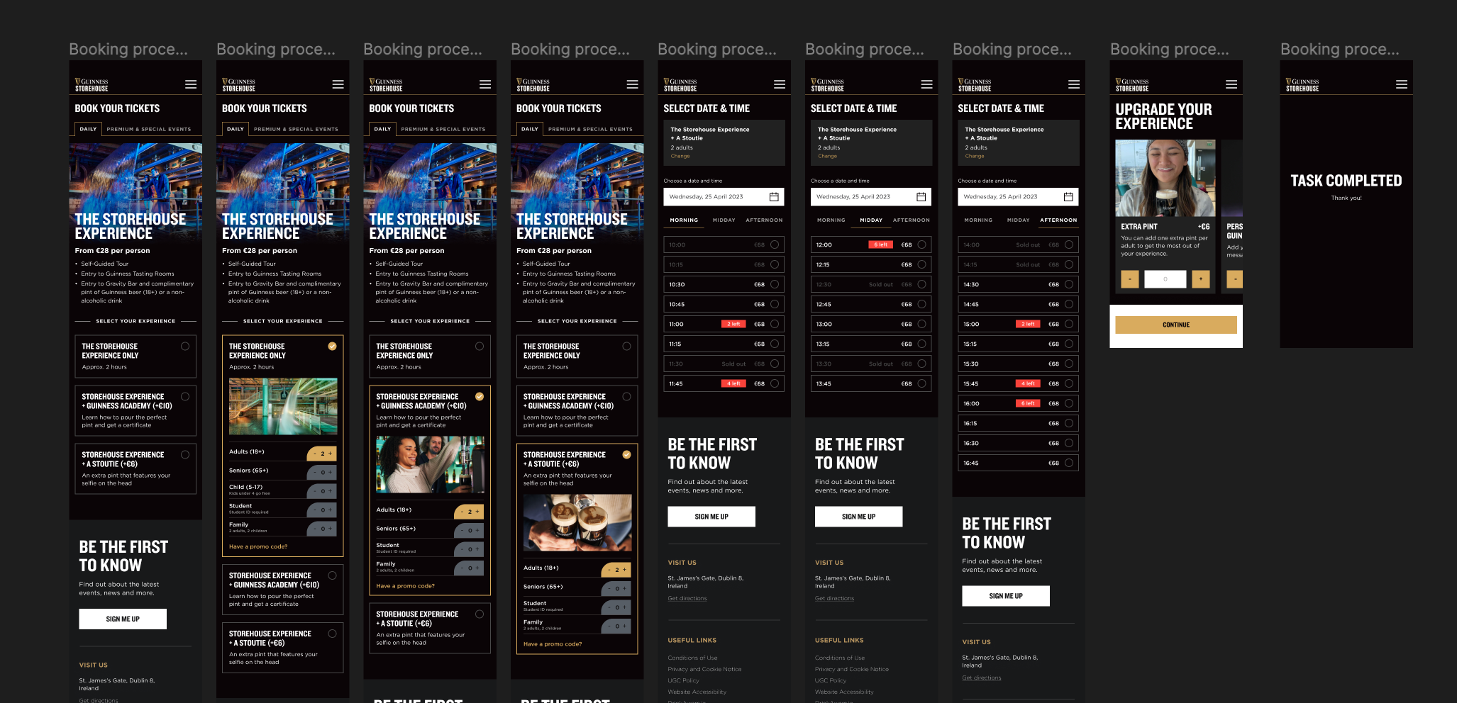
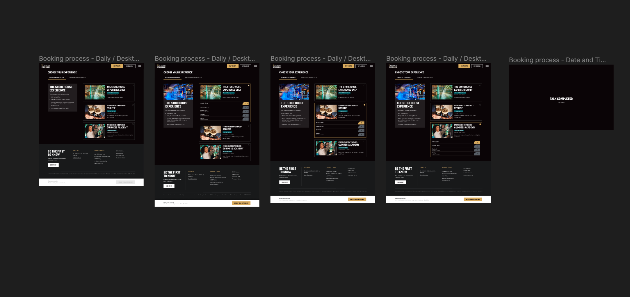
- Functionality to add/remove experiences
- Ability to build packages from single experiences
- Upsell products available at the storehouse within the booking experience (* but not products that are sold on the external shopify site)
- A simpler 'express' payment method for walk ups on the day
Technical limitations
- Secutex integrated payment solutions functionality limitations
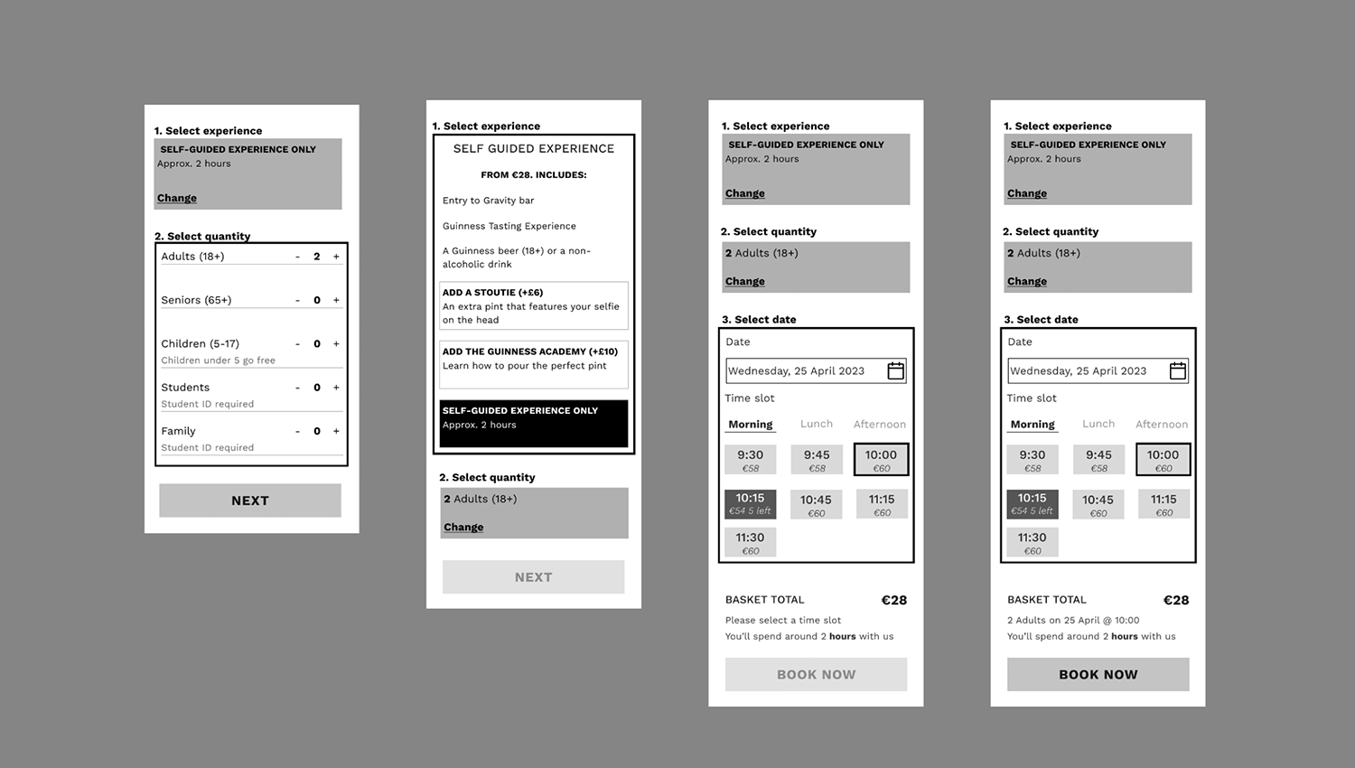
User testing - Internal in-person testing across the team (Diageo and Profero) and external remote testing through usertesting.com. The storehouse wants to increase the diversity (including gender / age / group types). Traditional Guinness die hard fans tend to be older males, however the storehouse is a multi- experience space for everyone - with this in mind we tested across a large age range to both genders. We also tested with frequent testers and infrequent testers who may be a little less experienced to get a well rounded view of the booking experience.
Usability testing included:
- Building your dream trip to the storehouse for you and friends / family
- Screen-grabbing (multiple) booked tickets
- Adding a Personalised Pint Glass to your booking